F1, Amazon, FedEx. Yes, these are very well-known and widely recognizable brand logotypes. The question, though, is whether you took notice of the little details that give them their flavor? Look more closely.
1. Formula 1
The most famous example – it may be difficult to notice at first but when you have a good look at the logo, you can see that it consists of two elements, not one: letter “F” and digit “1”, as well. Where? Look at the space between the letter and the red plane. Can you see it? It is even easier to discern when you look at the 3D logo visualization below.
![]()

2. Spartan Golf Club
This one is quite easy to make out: in the logo symbol there are both a golfer and the face of a Greek warrior wearing a helmet.
![]()
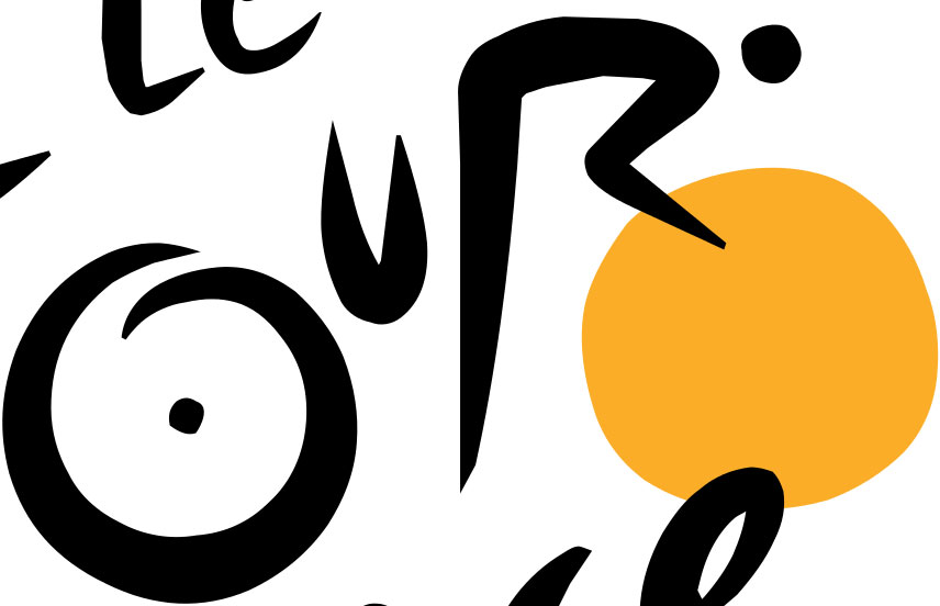
3. Tour de France
Only a dancing typography? Not necessarily. The authors smuggled in a cyclist on a bike between the letters of the logo:
![]()
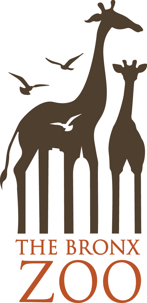
4. Bronx Zoo
The animals immediately attract one’s attention, as they are the main element of the graphic symbol. But have you noticed the space between their legs that forms the outlines of skyscrapers?
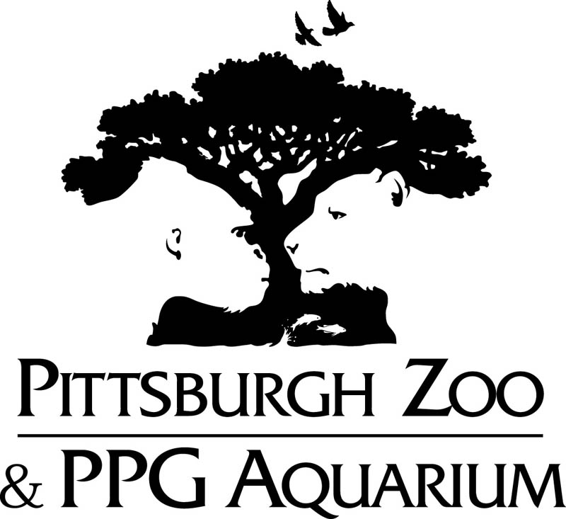
5. Pittsburgh Zoo
Another zoo and similar trick to the one used in the Bronx Zoo logotype. This time, however, two faces (of a monkey and a tiger) were embedded into a very complex symbol.
6. Hope For African Children Initiative
The graphical symbol has a very simple meaning – it contains the outline of Africa. But not only that; look more closely and search for faces.

7. FedEx
The most glaring example. Basically, it is strong typography combined with a sharp “edgy” symbol. And there lies its strength – in this way it was possible to put in an arrow between the letters “EX”.
![]()